
The Lexicon of Color | Prism Power
This is a transcript of Ep.01 of Prism Power entitled "The Lexicon of Color." View the full episode below.
Color is a deceivingly complex topic, primarily because so many of us are not familiar with all the terms that are encompassed within the word “color.” It’s kind of like trying to talk about a continent as if it was a country.
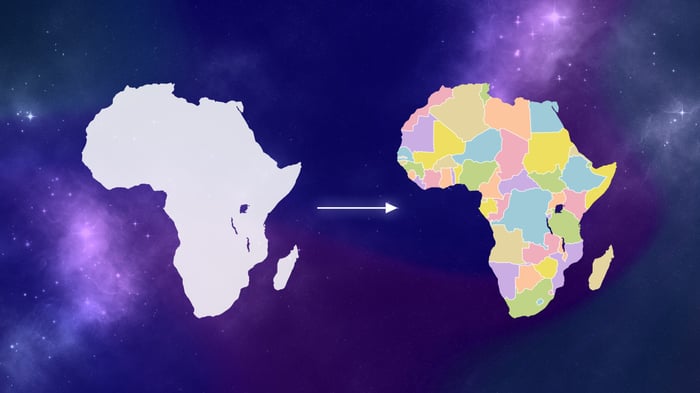 A continent often confused for a country.
By not being aware of the countries found within, you miss all the nuance and diversity that is present. And unfortunately when it comes to color, this is pretty common, even in professional spaces. For example, I have worked on animated productions where the art director would give design notes on color by saying things like “Could the designer make that blue, more blue?” or “That orange, a little less orange?” Since I was in the room with them, I knew what they were trying to say, but given the fact that most designers are not also telepathic, it could be difficult for someone to accurately decipher those type of notes. What that art director was missing was the vocabulary of color that would have better conveyed exactly what they were asking for. And I want to teach you that language. By learning how to speak color, you can more precisely describe what you might be looking for in your everyday life such as picking out a paint color for your house or a new dye color for your hair. So let’s dive in.
Color is made up of three components: Hue, Value and Saturation. Within each of these components exists additional layers of nuance and description. So let’s tackle them one at a time.
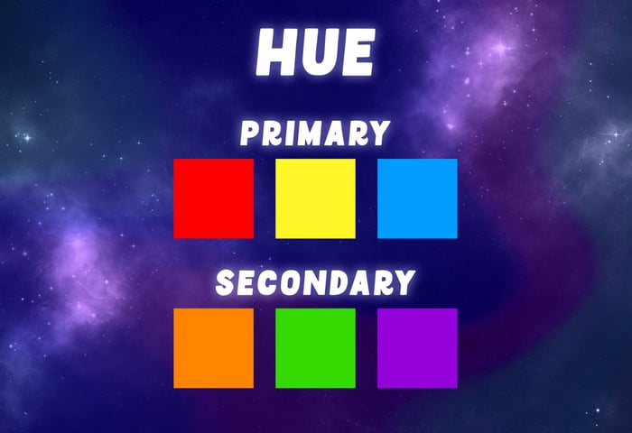
Hues are pure pigments. In other words, the purest versions of primary and secondary colors. Primary colors by the way, are hues that cannot be created by mixing other colors. These are red, yellow and blue. Secondary colors on the other hand, are hues that can be derived from mixing two primary colors together. These are orange, green and purple.
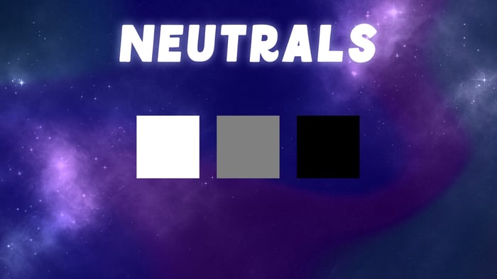
Colors such as white, grey and black however, are considered Neutrals–not hues–because they lack dominant wavelengths (we’ll get into wavelengths in the next episode) and are not part of a color family the way that hues such as yellow, blue or green are.
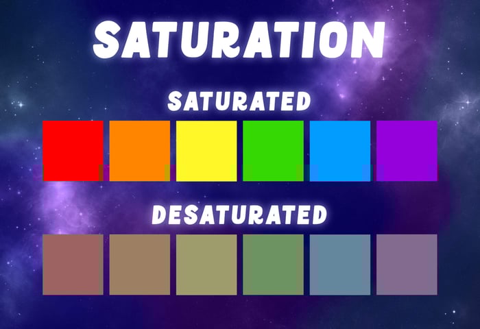
Next comes Saturation. Saturation describes the intensity of a color. Since hues are pure pigments, they inherently have the highest saturation levels possible within the color spectrum. Another term for highly saturated is Vivid. Now when you mix a hue with another hue, or with a neutral color such as black or white, then that color becomes desaturated.
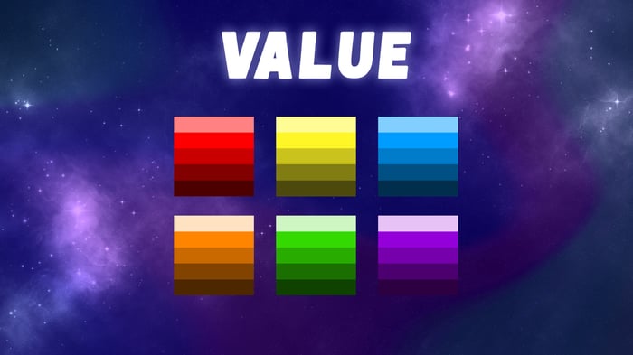
The last component of color is Value, which describes how light or dark a color is. So in other words a color can be light in value or dark in value.
Now, I want to go in depth with color in this series and I plan to use technical terms whenever possible, because I want everyone to be familiar and comfortable using them. Since like I said before, if you aren’t aware of these terms, then one might naively assume that working with color is more simple than it actually is. And I don’t want you to be caught off guard. So let’s go over words you’d use to describe mixing hues and neutrals together. These are Tint, Shade and Tone.
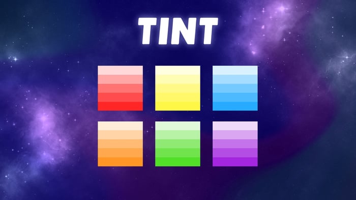
Tints are created by mixing white with a hue. The more white that is added, the lighter in value the color becomes. And you can see here that highly tinted hues are what we commonly refer to as pastel colors.
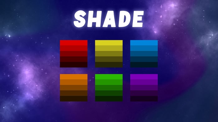
Shades are the opposite of Tints and involve mixing a hue with black instead of white. The more black that is added, the darker in value a color becomes.
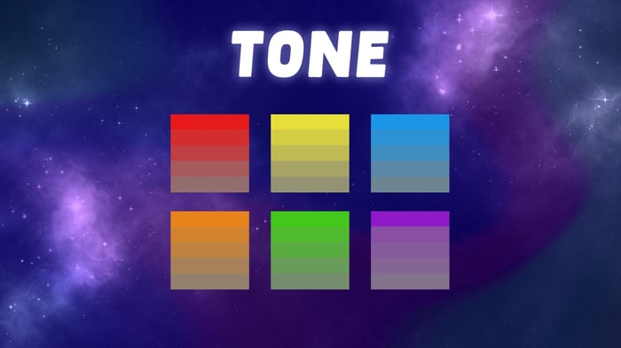
Finally there is Tone, and Tones are created by mixing grey with a hue. The more grey that is added to a hue, the more desaturated it gets.
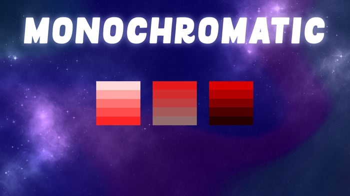
By the way, the resulting spectrum of Tints, Shades and Tones that you can create with a single hue, are considered Monochromatic colors. In other words, a Monochromatic color scheme consists of different colors that have been derived using a single hue in combination with neutral colors.
Now let’s cover terms that are often used to describe colors, such as contrast, brightness, warm and cool.
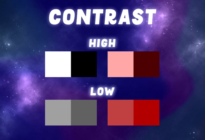
Contrast describes the difference between two things, in our case, colors. Most photo editing software associates value levels with contrast. With high contrast describing a high difference in color values, and low contrast describing a minimal difference in color values. But contrast can also be used to describe other qualities when it comes to color, such as placing a hue next to a tone. In that scenario, a contrast in saturation is happening.
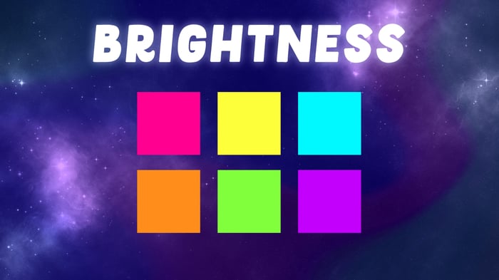
The term Brightness can also be applied in more than one way when it comes to color. For example, a bright color might be used to describe a hue that is both highly saturated and light in value. In other words, you would generally describe a color as bright if it appears intense, like a neon color for example.
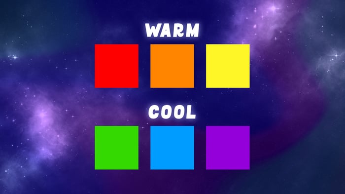
Warm and Cool describe the temperature of colors. Warm colors are hues like red, orange and yellow, or colors that have been mixed with these hues in order to appear more warm than they normally would be. Cool colors on the other hand, are hues like green, blue and purple, or colors that have been mixed with these hues in order to appear more cool than they otherwise would normally appear. Magenta for example, could be described as a warm purple or a cool red.
I’ve now equipped you with over a dozen terms that will help you to better describe colors. Although if we were to dive deeper into the realms of color theory, then I would go over more terms with you like Complementary and Tertiary. But at that point, we’d no longer just be talking about countries within the continent that is color, we’d be talking about counties. I have a feeling that we’ll touch base on these more nuanced concepts in future videos. Although for now, just know that even more terms exist when it comes to color.
Now, let’s circle back to the example of that art director and their vague color notes. Could there have been a better way to describe what they were looking for? Instead of asking that a blue be more blue, it would have been more descriptive to ask that designer make that blue more saturated. Or instead of asking for that orange to be a little less orange, they could have asked that the designer tone that orange down a bit.
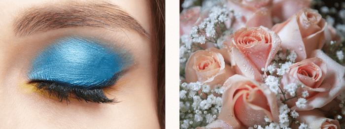 Instances where you may need to speak color.
I hope this information helps you to become more adept when talking about color in your everyday life, whether it is finding that perfect shade of eye shadow or ordering those dozen roses in that precise tint of pastel pink. But even more importantly, I hope that this helps to open your eyes to the complex world that is color.