
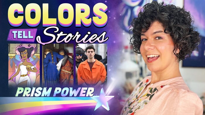
Storytelling With Color | Prism Power
This is a transcript of Ep.04 of Prism Power entitled "Storytelling With Color." View the full episode below.
Color stories can exist literally anywhere that color is found, it’s just a matter of noticing them and then knowing how to interpret them. I’ll be showing you quite an eclectic set of examples centered around characters and the colors they wear, to help illustrate this point. And in each of the following examples, I will reveal the color story hidden within so that you can start to identify or even create color stories for yourself.
As you know I’ve worked as a Color Supervisor on animated television programs. And while I was working on the show Krapopolis and helping to come up with the look of the characters on that show we ran into a dilemma which was: how should we differentiate gods from humans in color?
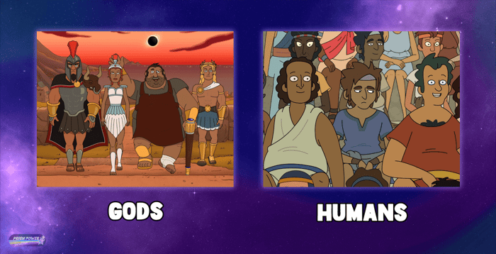
Since the writers and creator of the show wanted gods in Krapopolis to take on a human form but we still needed some way to convey to the audience that these characters aren’t really human and in fact have supernatural powers. And it was integral to the story that we find a way to communicate this visually.
Initially, the writers proposed that we give the gods gold skin, which we tried.
But we quickly discovered that this direction posed challenges for the animators and didn’t really work as well as intended. At this point, I suggested that we incorporate pure white into the clothing of the gods and demigods and that this color should be reserved only for these characters.
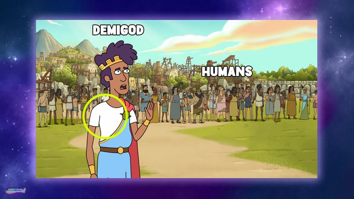
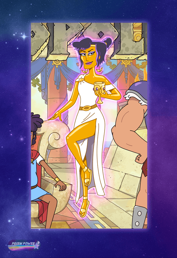
And as you know, white is a unique neutral color that can help to represent every hue in the visible spectrum and therefore this unique quality lends itself to being a color that is often reserved for special occasions. So it inherently has a revered quality to it and therefore would make sense to associate with a god. But when it came to the everyday citizens of Krapopolis, we used color to contrast their appearance by using paler hues for their clothing, but not pure white. Admittedly, there were some god designs that we encountered where it was challenging to incorporate pure white into their clothing simply because other colors just made more sense for that particular god. But if you look closely, you will be able to spot a speck of pure white somewhere on each god character in Krapopolis.
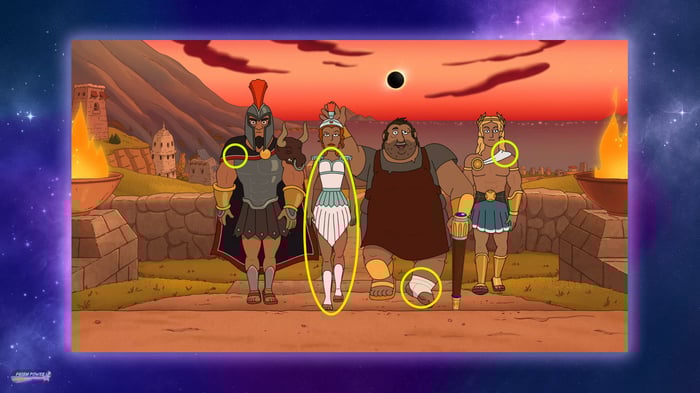
Another way that we made the gods look different from humans on the show is by giving them fantastical hair colors that we then matched to the color of their magical god powers. So all of these creative decisions that we made in color helped to convey the story that gods are both different and special from humans in this world. And we did that by intentionally preserving specific colors for specific types of characters which then created a visual contrast with the other characters on the show.
For our next color story we are going to travel back in time to 18th century Europe when this painting by Frederic William Burton was created.
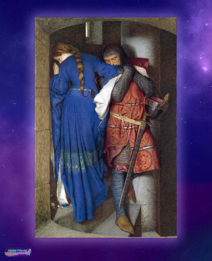
Entitled Hellelil and Hildebrand, the Meeting on the Turret Stairs. This watercolor, painted in 1864 was inspired by a medieval Danish Ballad. This ballad tells the story of Hellelil, a Lord’s daughter who falls in love with Hildebrand, one of her guards. It’s a forbidden love story that spoiler alert, ends in the death of Hildebrand. Burton chose in this painting to capture one of the last times that Hellelil and Hildebrand see one another alive in this fleeting moment as they pass each other along a stairwell. The tight nature of the composition is definitely playing a part here in helping to convey the intimate emotions happening between these two characters in this scene. But the colors that they are wearing are also playing a critical role in helping to tell their love story.
Hellelil is depicted here in a blue dress. As you know, blue is a cool primary color. Hildebrand on the other hand, is predominantly wearing red, which is a warm primary color.
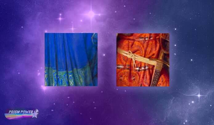
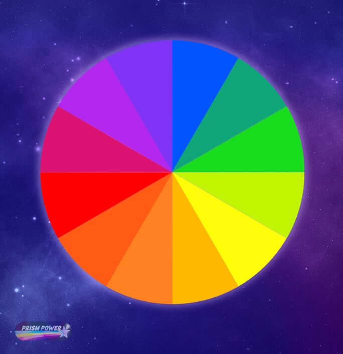
Although blue and red are not complimentary colors, which are hues that lay across from each other on the color wheel.
Blue and red just seem to inherently work well together as a pair because they are both primary colors that also have a contrast in temperature. So it’s like they’re on the same level and can help to balance each other out. Therefore by choosing these particular colors for their clothing, Burton helps to convey to the viewer that these two characters are a pair. They belong together. They go well together. And the neutral, grey stairwell these vibrantly dressed characters are seen against not only helps these characters to stand out in this scene, but it also helps to contrast their beautiful love story against a dreary, grey reality that they find themselves in.
There is an added element of storytelling happening with the red and blue here because this tragic love story ultimately ends with Hildebrand’s death and Hellelil mourning him. Therefore the red that Hildebrand wears foreshadows the blood he will spill because of this forbidden love and the blue that Hellelil wears foreshadows the somber and blue emotions she will experience upon his death.
I know I told you that we would be looking at an eclectic set of examples in this episode, and I plan to deliver on that promise by taking you to present day New York in this next example.
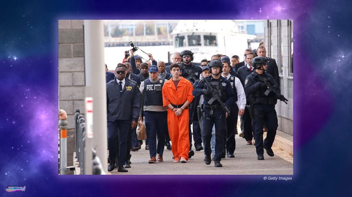
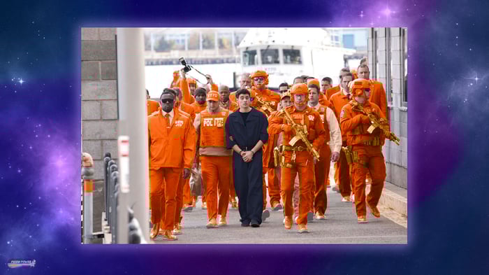
There is a color story happening here in this photo of CEO murder suspect, Luigi Mangione shown escorted by an excessive police presence as he makes his way from a Pennsylvania correctional facility to a Federal prison in Brooklyn, New York, where he currently awaits trial. This over the top perp walk was clearly staged by authorities to send a message to the public. Although I don’t think it was the message they were hoping for, and part of what they failed to consider is the colors in this scene.
When you think of what a bad guy or a criminal would be seen wearing, you usually think of dark, neutral colors because these are people who are trying to hide in the shadows and do not want to be seen.
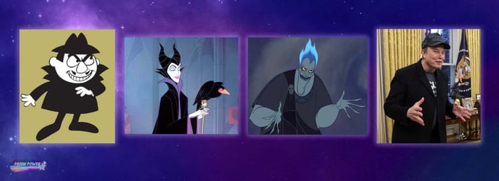
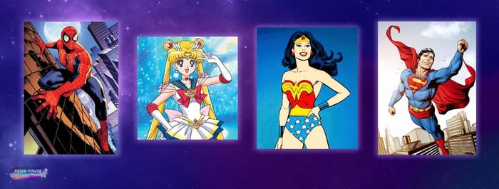
And unless you are Batman, heroes are typically shown wearing bright, saturated colors because they’re the good guys. They want people to be able to easily spot them since they’re there to help.
So with these subconscious, color dynamics in mind, who here is being set up to look like the hero and who are the bad guys?
And I feel that this color story is being emphasized by the number of armed officers surrounding Mangione since all of their dark clothing heightens the contrast happening here and makes Luigi stand out more. For example, if only one officer was by Luigi’s side, then his orange jumpsuit would have stood out less and then the heroic storyline that is being subconsciously communicated here through color, would be a little less obvious.
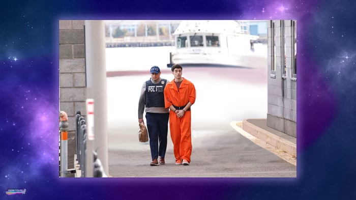
If you still have any doubts as to the critical role that color is playing in this scene, just consider this same photo, but with their clothing colors reversed:
And just like that, the story is flipped and the message that the Feds and NYPD were probably trying to send, suddenly comes across. That is how powerful color is. But unlike the authorities, you’ll know to consider everyone’s clothing colors before you help to stage a perp walk.
I hope I made it abundantly clear in each of these examples we covered that the color a person wears can help to tell a story, especially when it is contrasted against another character’s colors. And these stories can happen anywhere and at anytime, either intentionally or unintentionally. Wherever color exists, a story can be told. And now you know the clues to look for in order to find it. See you next time on Prism Power!