
Illegal Colors | Prism Power
This is a transcript of Ep.03 of Prism Power entitled "Illegal Colors." View the full episode below.
Did you know that there are certain colors that are banned from appearing on animations made for TV? In this episode, I’m going to take you behind-the-scenes and reveal to you these illegal colors.
The majority of my professional art career has been centered working in animation. With the last 5 of those years serving as a Color Supervisor on cartoons made for television. And along the way, I’ve learned that color can be a critical factor when it comes to what is okay and not okay to show on television.
First, you need to know that there is a National Television System Committee, or NTSC for short, that was formed in the United States in 1940 in order to create technical standards for black-and-white televisions.
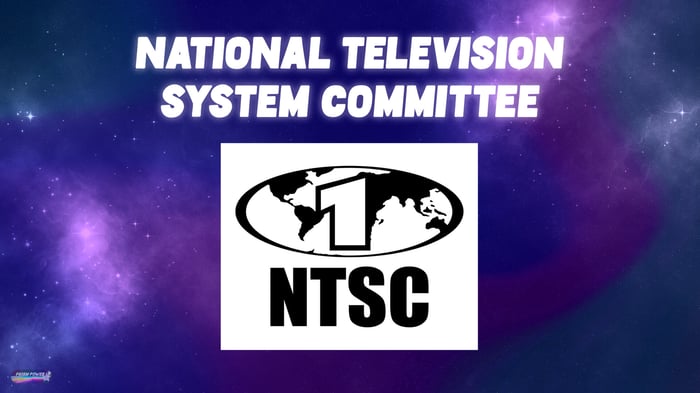
Because before this, television manufacturers were just doing things on their own and duking it out with their competitors by using different forms of technology and aspect ratios. But the creators of programs made for TV needed a standard that they could faithfully work within in order to make their shows so that as many people as possible could watch them, no matter what kind of TV set they may have owned.
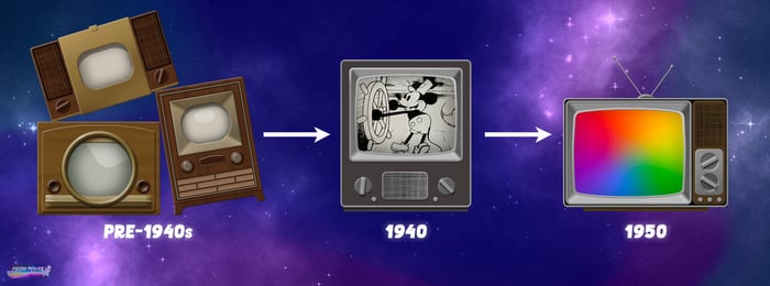 A brief, visual history of television sets.
And in 1950 this committee convened to create standards for color television. These color bars for example, were originally designed to calibrate analog NTSC equipment.
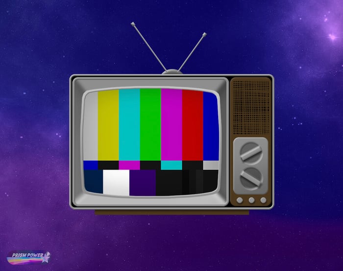 SMPTE color bars designed to calibrate NTSC equipment.
Now, if you recall our discussion about wavelengths from our last episode, you’ll know that the color red has the longest wavelength in our visible spectrum. And it’s usually warm colors with longer wavelengths and that are also highly saturated, particularly certain hues of red, that tend to cause problems for TVs. Sometimes it’s just a visual distortion, such as an image bloom, that these pure hues might cause because of the display limits of television monitors.
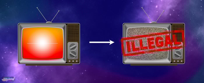 Highly saturated, warm colors can cause display issues on TV's. These colors are considered "illegal" by the NTSC.
 But in other cases, there are colors that the NTSC has actually deemed “illegal” because they can interfere with the broadcast signal of a program. The creators of the vibrantly colored animation “Mission Hill” ran up against these limits, but still managed to create a visually appealing show while incorporating a lot of saturated cool colors into their characters and backgrounds.
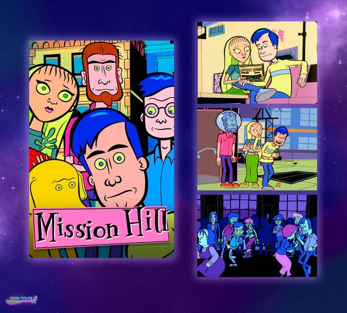 Cover image and episode stills from the Adult Swim, animated television show, "Mission Hill."
Besides NTSC, there is another industry acronym that I need to tell you about here called S&P, otherwise known as Standards and Practices.
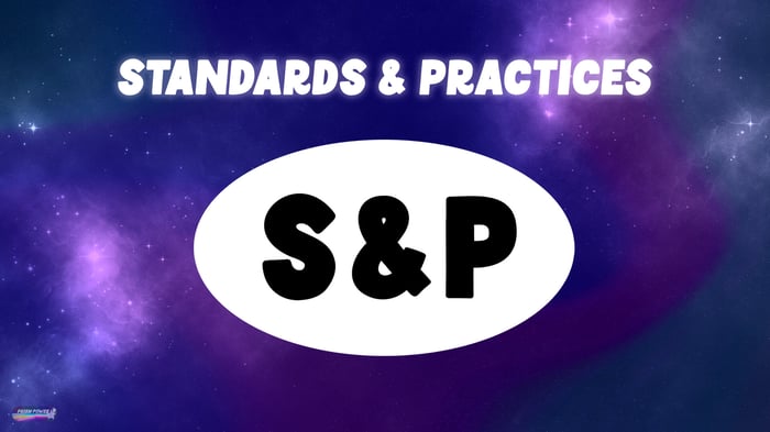
Every network has an S&P department that pours over every line of dialogue and looks over every image of a program, prior to broadcast, in order to make sure that nothing problematic will make its way on television. Since networks are in the business of entertaining people not offending people, and therefore they want to avoid as much as possible getting themselves in any kind of legal jeopardy.
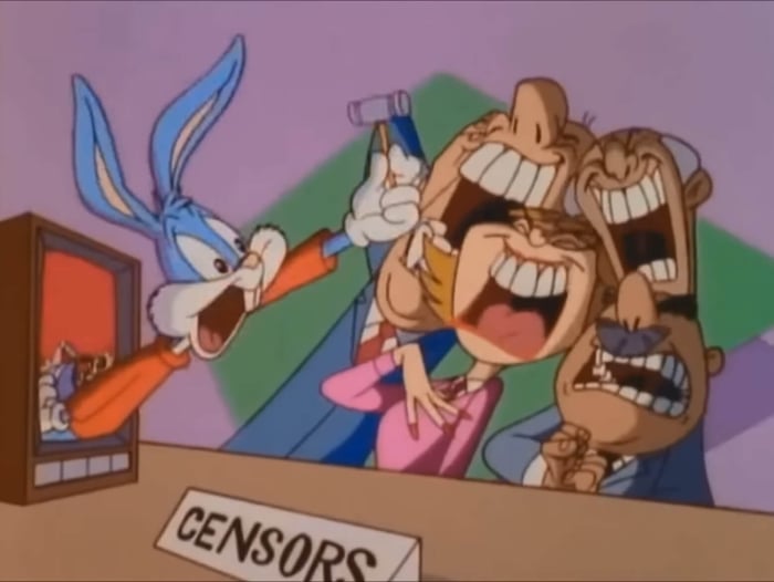 Bugs Bunny offending S&P on "Tiny Toons Adventures."
And the interesting thing that I have discovered working as a Color Supervisor is that more often than not, it is the color of an object that can be the deciding factor as to whether or not that object will be allowed to be shown on screen.
One major factor that influences how strict or lenient S&P is when making their decisions on approvals are the parental guidelines or age rating of a television program. For example, Rick and Morty used to be rated TV-MA for Mature Audiences only, when it originally aired late at night on Adult Swim.
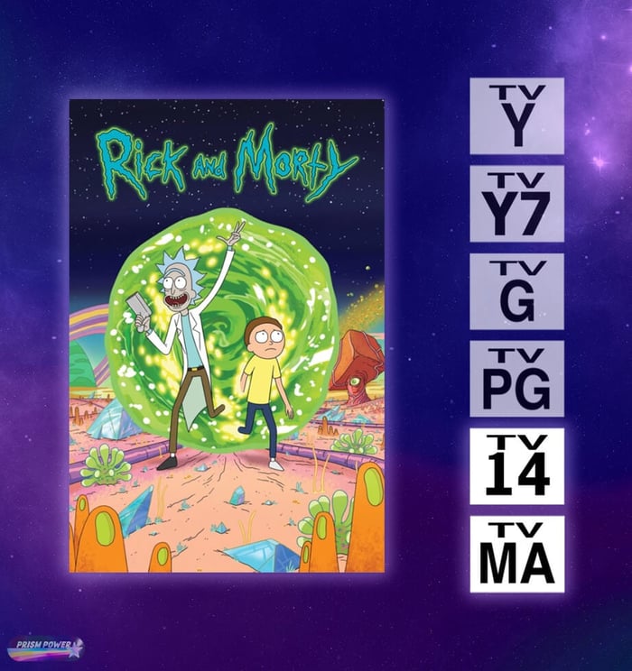 On the left are the parental guideline, age ratings of television shows. Rick and Morty was originally rated TV-MA and then changed to TV-14.
Although with time, Rick and Morty’s audience grew beyond the 18 and older crowd and began to air earlier in the evening to accommodate a larger and younger audience. And it was around this time that their rating changed to TV-14. So what does this all have to do with color? Well once Rick and Morty’s age rating changed to accommodate a younger audience, the artists on the show began to encounter more restrictions with what they could show on screen which in some cases has directly impacted their color choices.
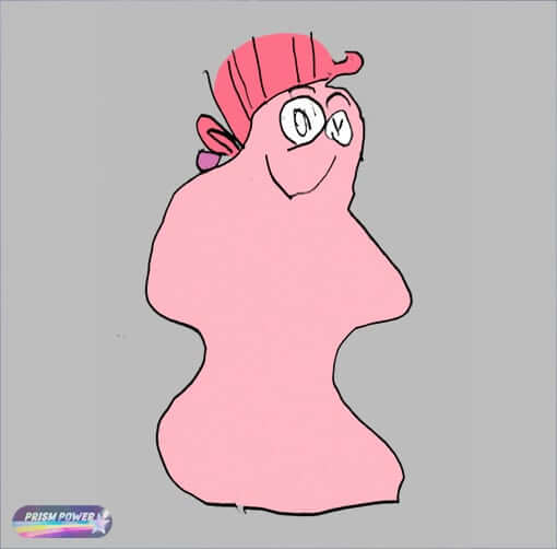
Now I can’t necessarily go into too much more detail here when it comes to Rick and Morty but I can tell you about unexpected issues with color that I did encounter on two other TV-14 rated shows that I Color Supervised on. The first memorable encounter I had with S&P was while designing the colors for an anthropomorphic shampoo bottle that aired on the sixth episode of the third season of Duncanville. For legal reasons, I can’t show you that actual prop with the unapproved colors on it since the network had their reasons for not wanting those versions shown on screen, but I can show you a recreation of the prop as drawn by my 5 year old…
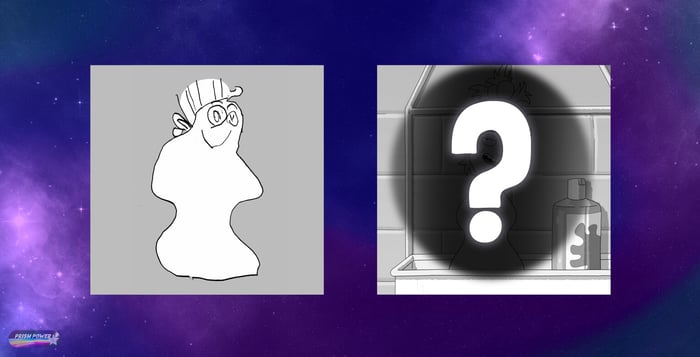 My 5 year old's rendition of an anthropomorphic shampoo bottle. Hidden on the right, is the actual prop as shown on screen.
 and afterwards I can show you what the final, approved version looked like on screen. In this episode of Duncanville, Duncan accidentally catches his mom Annie, naked, which traumatizes him so much that he begins to see his naked mom in everyday objects including a shampoo bottle which morphs into the image of his mom.
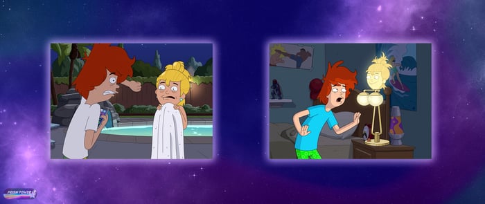 Image stills from the Duncanville episode, "Throw Mama from the Brain."
As a Color Supervisor I work with a team of artists that are made up of Background Painters and Color Designers to design the color of everything you see on screen in an animated program. So originally this assignment was handed over to our Color Designer and she naturally colored the bottle the same peach skin color as the character Annie.
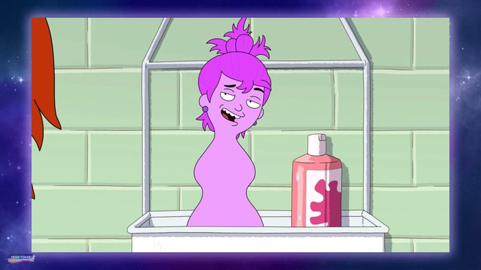
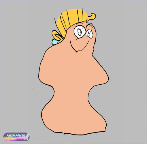 Version 1 in color.
Although once S&P caught sight of this prop in color, I received a message saying that the color we had chosen was problematic because it too closely resembled a woman’s nude body, and was not acceptable for a TV-14 audience. I was advised to instead pick a different color, perhaps pink, and to keep all the colors on the prop monochromatic in order to deemphasize the realism. As you know, color exists on a spectrum, so I’ve always found these back and forths with S&P fascinating because at what point is peach considered pink enough to no longer cause an issue? Well apparently, this was not pink enough and we were told to go back to the drawing board.
 Version 2 in color.
By this point, I overtook handling the color revisions on this prop as the Color Supervisor in the hopes of reaching an approved color since my team ultimately had a deadline that we were working together to hit. And I have to take a moment here to say that another interesting factor to all this is that the writers on these shows ultimately want to sell a joke and if our designs steer too far away from what they had originally intended because of the judgement calls that are coming our way from S&P, then the writers will sometimes intervene and try to argue their case as to why something needs to appear a certain way on screen.
 A writer who wants to make sure that their joke still reads in color.
So as an artist on a show like this, I often find myself caught in the middle trying to appease both the writers and a network’s S&P department. Well the color they both ultimately settled on for this anthropomorphic shampoo bottle was this bright, violet color.
 An inoffensive color for a shampoo bottle.
The second TV-14 rated show that I’ve worked on as a Color Supervisor is Krapopolis. If you’ve watched the show, then you know that it can get gory at times with depictions of flaming heads and frozen bodies making their way on screen.
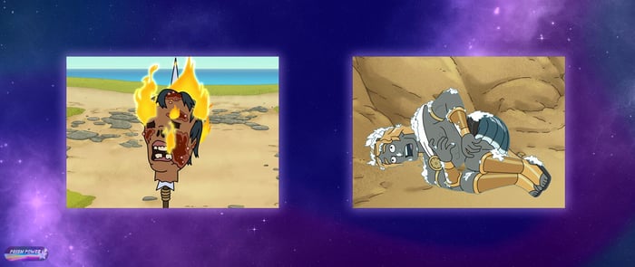 Image stills of Krapopolis.But as I discovered, showing cartoon renderings of blood on television to those 14 years and older -- not a problem. In fact, I initially decided to depict the color of blood on the show as a slightly transparent, dark red. As you might imagine spilled blood to look like. Although about halfway through production on the first season, we received a request from our Executive Producer asking to pump up the blood in color, which we did by making it opaque and changing the color to a more brightly, saturated red. We also added a few highlights or shine marks to help make it look more viscous.
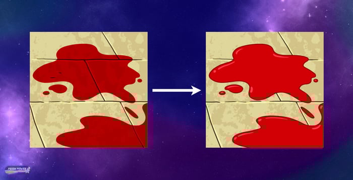 On the left is how blood first appeared on Krapopolis, and on the right is the updated version.
So colors normally associated with blood and gore were a-okay. But what was a problem according to S&P was brown poop.
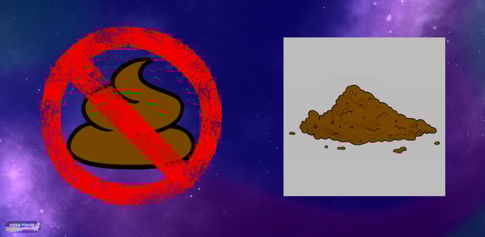 Poop is not allowed to be brown on TV-14 rated shows.
The artistic rendition on the right, by the way, was created by my 9 year old. For some reason, beyond my own understanding as a parent with two young kids who love to joke about poop, I was told as the Color Supervisor to not color this pile of pig poop that aired in the 4th episode of the 1st season of Krapopolis, brown. I was advised instead to color it grey in order to not inadvertently offend anyone. Now, if I had colored this prop a true, neutral grey, it would have just looked weird. And again, as you know, color exists on a spectrum, so I instead decided to start with the color brown and tone it down and desaturate it just enough for S&P to put their stamp of approval on it. And here’s what the final version looked like on screen.
 And inoffensive color for pig poop.
I bet you had no idea before this about all the colors you were missing out on while watching some of your favorite animated programs. I hope this revealing information gives you a new appreciation as to the importance of color and how it can play such a crucial factor in how we interpret what we see on television. See you next time on Prism Power!